這個小專案是來自https://javascript30.com/的教學,點擊進去輸入email後就可以進入課程~!此為第五篇學習心得。一樣先附上程式碼。
HTML
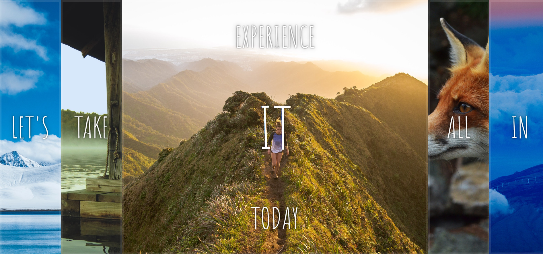
<div class="panels">
    <div class="panel panel1">
      <p>Hey</p>
      <p>Let's</p>
      <p>Dance</p>
    </div>
    <div class="panel panel2">
      <p>Give</p>
      <p>Take</p>
      <p>Receive</p>
    </div>
    <div class="panel panel3">
      <p>Experience</p>
      <p>It</p>
      <p>Today</p>
    </div>
    <div class="panel panel4">
      <p>Give</p>
      <p>All</p>
      <p>You can</p>
    </div>
    <div class="panel panel5">
      <p>Life</p>
      <p>In</p>
      <p>Motion</p>
    </div>
  </div>
CSS
 html {
      box-sizing: border-box;
      background: #ffc600;
      font-family: 'helvetica neue';
      font-size: 20px;
      font-weight: 200;
    }

    body {
      margin: 0;
    }

    *,
    *:before,
    *:after {
      box-sizing: inherit;
    }

    .panels {
      min-height: 100vh;
      overflow: hidden;
      display: flex;
    }

    .panel {
      background: #6B0F9C;
      box-shadow: inset 0 0 0 5px rgba(255, 255, 255, 0.1);
      color: white;
      text-align: center;
      align-items: center;
      /* Safari transitionend event.propertyName === flex */
      /* Chrome + FF transitionend event.propertyName === flex-grow */
      transition:
        font-size 0.7s cubic-bezier(0.61, -0.19, 0.7, -0.11),
        flex 0.7s cubic-bezier(0.61, -0.19, 0.7, -0.11),
        background 0.2s;
      font-size: 20px;
      background-size: cover;
      background-position: center;
      flex: 1;
      display: flex;
      justify-content: center;
      align-items: center;
      flex-direction: column;
    }

    .panel1 {
      background-image: url(https://source.unsplash.com/gYl-UtwNg_I/1500x1500);
    }

    .panel2 {
      background-image: url(https://source.unsplash.com/rFKUFzjPYiQ/1500x1500);
    }

    .panel3 {
      background-image: url(https://images.unsplash.com/photo-1465188162913-8fb5709d6d57?ixlib=rb-0.3.5&q=80&fm=jpg&crop=faces&cs=tinysrgb&w=1500&h=1500&fit=crop&s=967e8a713a4e395260793fc8c802901d);
    }

    .panel4 {
      background-image: url(https://source.unsplash.com/ITjiVXcwVng/1500x1500);
    }

    .panel5 {
      background-image: url(https://source.unsplash.com/3MNzGlQM7qs/1500x1500);
    }

    /* Flex Children */
    .panel>* {
      margin: 0;
      width: 100%;
      transition: transform 0.5s;
      display: flex;
      flex: 1 0 auto;
      align-items: center;
      justify-content: center;
    }

    .panel p {
      text-transform: uppercase;
      font-family: 'Amatic SC', cursive;
      text-shadow: 0 0 4px rgba(0, 0, 0, 0.72), 0 0 14px rgba(0, 0, 0, 0.45);
      font-size: 2em;
    }

    .panel>*:first-child {
      transform: translateY(-100%);
    }

    .panel.open-active>*:first-child {
      transform: translateY(0);
    }

    .panel>*:last-child {
      transform: translateY(100%);
    }

    .panel.open-active>*:last-child {
      transform: translateY(0);
    }

    .panel p:nth-child(2) {
      font-size: 4em;
    }

    .panel.open {
      font-size: 40px;
      flex: 5;
    }
Javascript
const panels = document.querySelectorAll('.panel')
    function change() {
      console.log('hi')
      // this.classList.toggle('open-active')
      this.classList.toggle('open')
    }
    function change_active(e) {
      console.log(this)
      if (e.propertyName == 'flex-grow') {
        this.classList.toggle('open-active')
      }
    }
    panels.forEach(item => item.addEventListener(('click'), change))
    panels.forEach(item => item.addEventListener(('transitionend'), change_active))
學習重點
這個專案較為特別,JS的部分非常少,主要著重在CSS transform以及flex的應用
- 了解flex grow 以及flex shrink的應用,底下的參考文章非常的棒,講得極端清楚。
- 複習flex的使用方式。
- 複習vh/vw的使用。
- 利用 translateY ()讓元素進行垂直位移,若用100%則表示完全隱藏。
- 將click與transitionend做配合使用,但關於change_active的部分仍未完全了解,需要再做釐清。
最終成品
https://windate3411.github.io/flex_panel-JS30-5-/
參考文章
详解 flex-grow 与 flex-shrink
[筆記] 好用的css 3新單位vh vw ─ 讓你的圖片可以隨著螢幕大小而不同
 Danny的學習紀錄